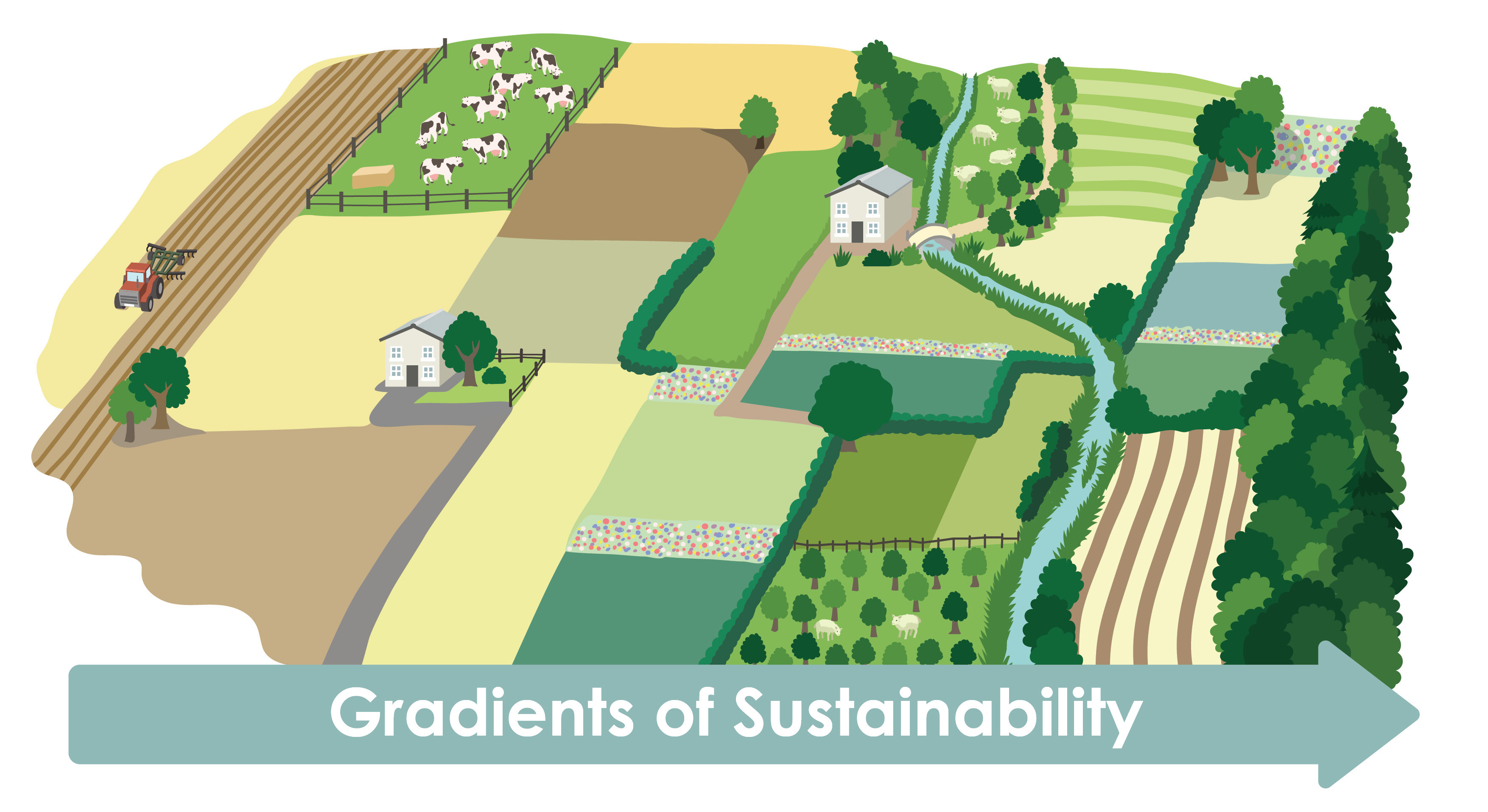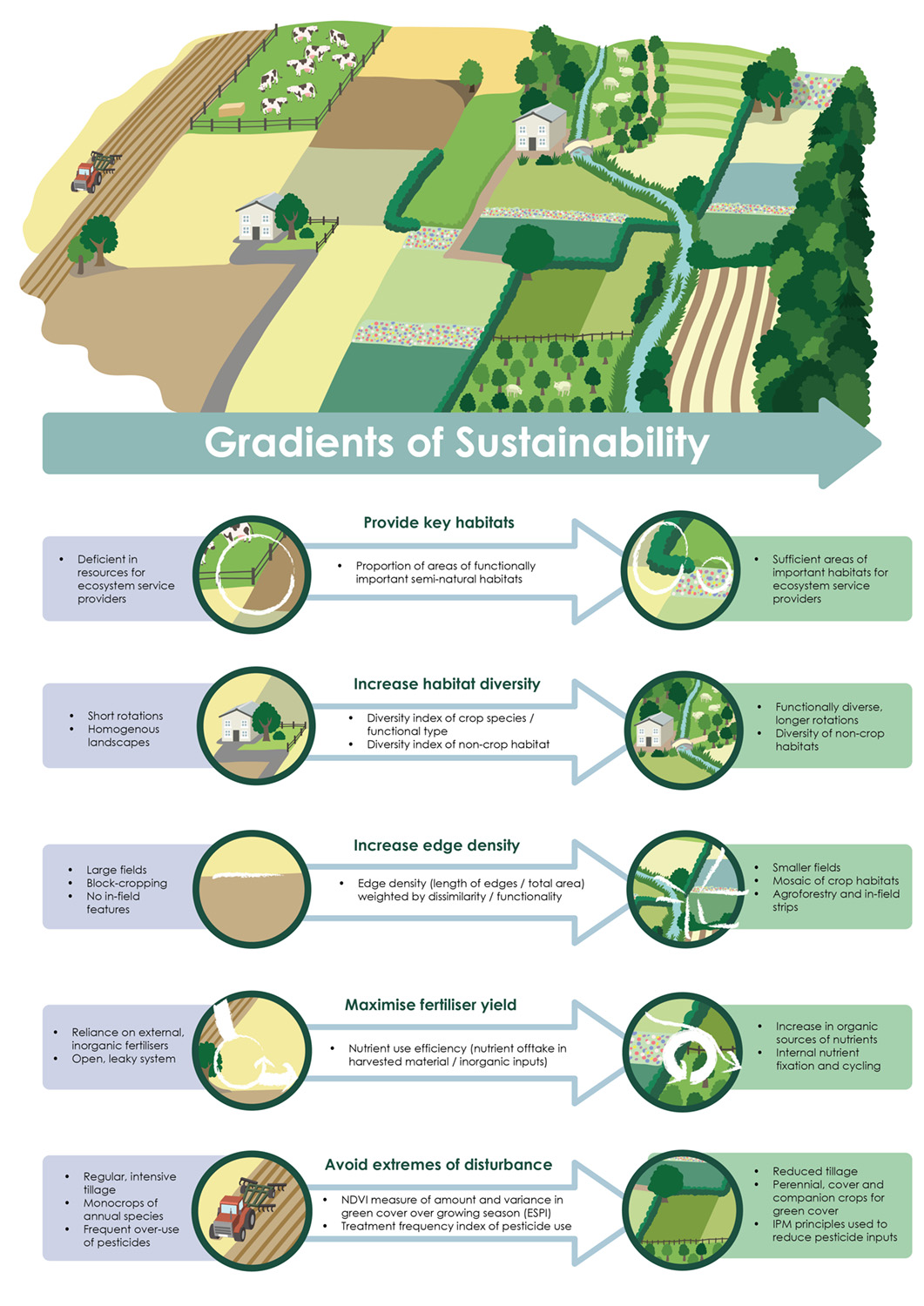
Jon commissioned an illustration and infographic to communicate the "Gradients of Sustainability" framework: a way of understanding and measuring how far a farmed landscape sits along a spectrum from ecologically depleted to ecologically rich. Jon provided a sketch of how he imagined the infographic which was worked from to develop the final vector based illustration.
The illustration shows this as an aerial view of a countryside scene, shifting from intensive, low-diversity farmland on the left through to a mosaic of habitats, hedgerows, diverse crops and watercourses on the right.
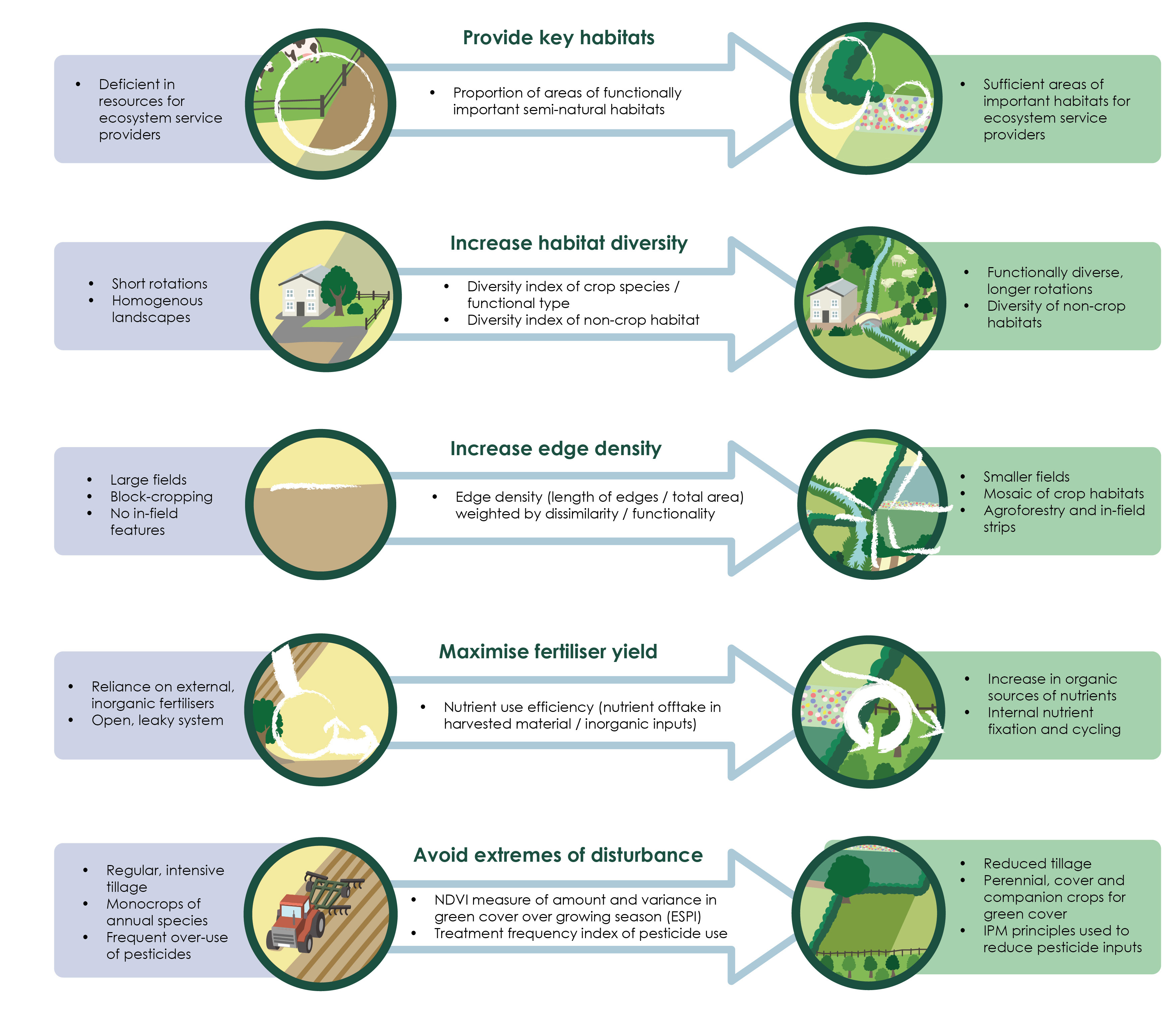
The scene was then used as the basis for a full infographic, with five sustainability indicators laid out beneath it: providing key habitats, increasing habitat diversity, increasing edge density, maximising fertiliser yield efficiency, and avoiding extremes of disturbance.
Each indicator is illustrated with a pair of circular vignettes drawn from the main landscape scene, showing the unsustainable and sustainable ends of that particular gradient alongside the metrics used to measure progress between them.
The finished assets were delivered as PDFs and JPEGs for use in research publications, presentations, and outreach. As it is vector based it can be scaled to print at any size without image quality loss.